

A collaboration to create a compelling brand experience for target personas.
Ecolens is a start-up founded in late 2023. As a supply chain platform, they provide data-gathering solutions for the construction industry to manage their sustainability and compliance goals. Their mission is to eliminate the negative impact companies and people have on the environment, specifically in the construction industry.
UX/UI Internship
March 25 - April 22, 2024
Project Lead / UI Designer /
User Researcher
User flows / User testing script & data / Site Analysis / Wireframes

Problem: The old Ecolens website did not fit the tech-driven brand, and did not yet compel or encourage target personas to take action when visiting the site. I teamed up with a fellow Springboard colleague to work on this problem alongside Ecolens founders.
Solution: A rebranded site that better communicates the professionality and tech-oriented brand of Ecolens and their solution. It would also communicate more clearly what Ecolens does and compel action from their visitors.

User personas | Webite Analysis

Developers
Develops projects within sustainability requirements.
.png)
Contractors
Contacts suppliers for ESG data for reporting purposes.
.png)
Manufacturers
Provides data on supplies and materials.
Established Personas
Through extensive interviews and research, our client had already established 3 industry personas: Developers, Contractors, and Manufacturers. A fourth outside of the industry would be potential partners. My colleague Ray and I worked together to research the personas and discuss the conversion goal.
Client Goals
Our end goal was conversion of visitors; For industry personas to book a demo session of the Ecolens solution, and for potential partners to contact them or to sign up for the newsletter.
Ray and I looked through the original site (shown below) and compared our own notes. We found a number of roadblocks in the design or content that could be hindering conversion (see full analysis presentation)
Heuristic evaluation and Ecolens site analysis


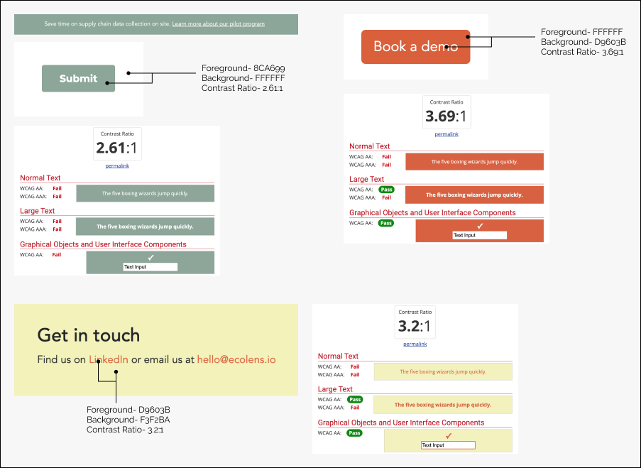
Failed accessibility scores for color theme. The style also did not match their desired brand (Techy, trustworthy, professional and knowledgeable.)
Competitor comparisonThe majority of the prior website existed on one page with very little information. We looked at how other competitors to Ecolens displayed their information and compelled visitors to take action. One main example was Let'sBuild.com
Let'sBuild.com provides construction management software "helping general contractors plan, manage, inspect and track." Here's what we noticed about their website:


After identifying hinderances on the Ecolens website and viewing competitor websites, I was tasked with creating a sitemap for the founders. Visual design aside, here was our focus in order to move towards our goals for the site:
site map | Lo-Fi Wireframes
Instead of having one page, we let users take the path they need with specifics they are looking for. Since we had multiple personas, we framed our choices and design with the question, “Who is this page speaking to?”
I created a site map with areas of content to visualize how we can address our main focuses: Better information architecture; more compelling reasons to take action; and a clearer picture of who Ecolens is and what they do.


The wireframes above show 1) a new Mission Page for better sharing of who Ecolens is; 2) a Persona Page with visitor-specific information; 3) a Solution Page to better sell the pilot program.
Brand style | Figma prototyping
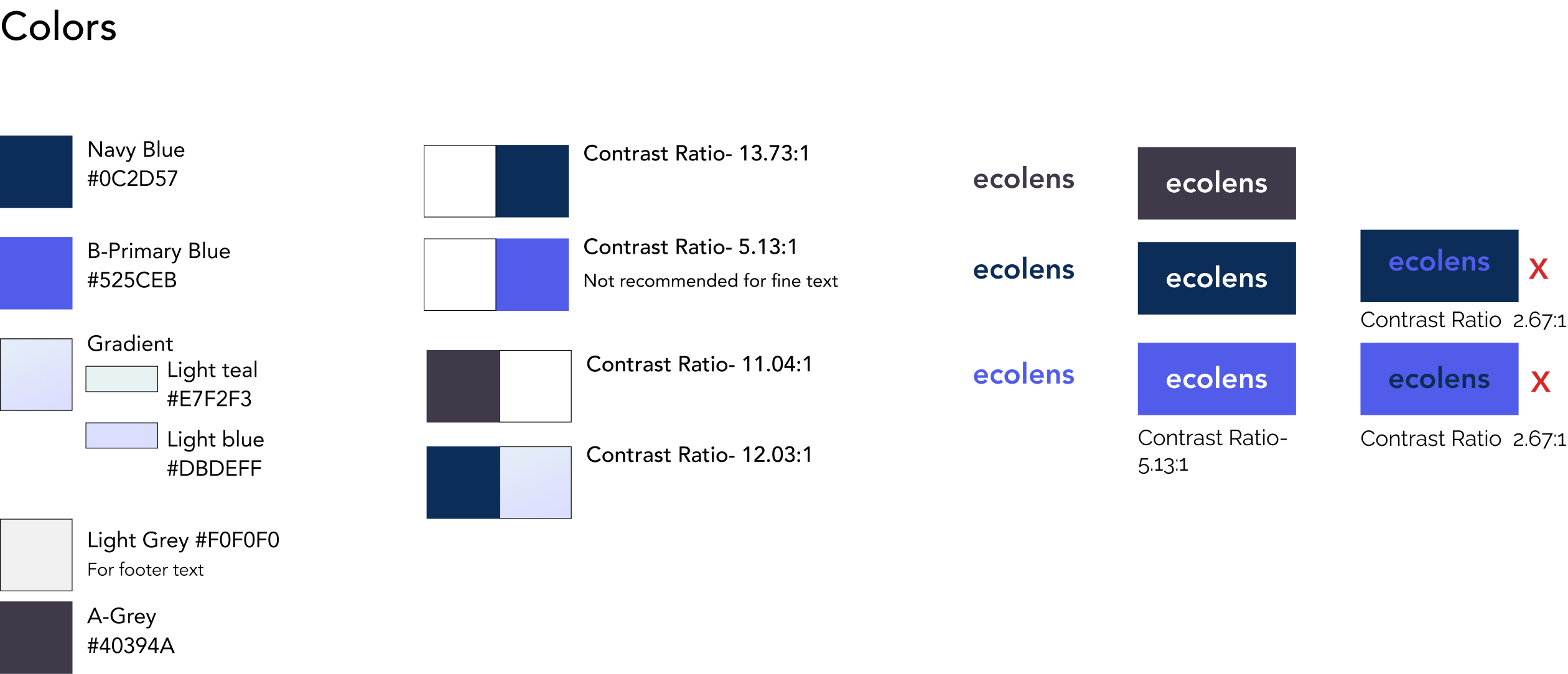
The brand wanted to be seen as a tech-based company, new, professional, knowledgeable and trustworthy. The current colors and imagery didn’t match these characteristics, and we knew key areas of change included color, imagery, and motion.
We also ran an audit on the current brand colors...they did not meet accessibility standards. We shared this with the client and discussed possible solutions. Two of the color themes presented were chosen and presented during testing later.


We utilized motion to accomplish three things:
User testing | Presentation of results
With the help of our client, we secured 4 individuals for user testing. In the 2-day time limit, we were not able to wait to schedule a 5th as we’d aimed to have. I conducted each test while my colleague assisted in observing and taking notes. We found 3 key repeating insights throughout:
Testers desired to see key information sooner (searching on the home page for info). This information is what would compel them to take action.
Testers preferred the blue color theme vs. the green, seeing it as more “professional”
Testers matching our persona’s industry felt the language was clear and easy to understand while those outside of the industry did not feel a clear understanding.
Applying insights to change
Based on the testing results, we made changes to the prototype, including removing the solution page from our flow and shifting key content to the home page instead. We also adapted each page header to include static imagery instead of placeholder stock videos to minimize any distraction. While the project has more stages to go until it is developed, my colleague and I were excited to be able to provide our clients with helpful user data, and a data-informed prototype.
If I had to start over, I would push for content from our client earlier in the process. Because of our 4-week time limit (including onboarding and research), we were wire framing without truly knowing content until the (literal) final hour before testing.
keeping tabs on our timeline helped me to be more organized as a designer. Working remotely and collaboratively meant regular notes and questions for my colleague had to be high priority. This was especially true for handoff for the client. Working with a team was a refreshing change from individual, self-driven projects.
Finally, clear, intentional communication when working remotely is the way to go. Not having the benefit of a shared location or timezones meant there are less opportunities to touch base throughout a day. I was fortunate to work with others who were very responsive, and the faster I asked clarifying questions, the faster we could move on and make progress.