.png)
Springboard Capstone 1 Project
I focused on a problem that many (including myself) have experienced. In fact, it’s the main reason I don’t live in a large city. Why the heck is parking such a pain? How can I make it better?
UX/UI Capstone Project
Fall, 2023
UX & UI Designer / Test Facilitator
Heuristic Analysis | Empathy Map | Moderated Tests | Wire frames | Prototype
Problem: How can parking be made less stressful for drivers?
Solution: A hybrid app to help provide more positive experiences in parking with access to accurate, relevant, and current information.
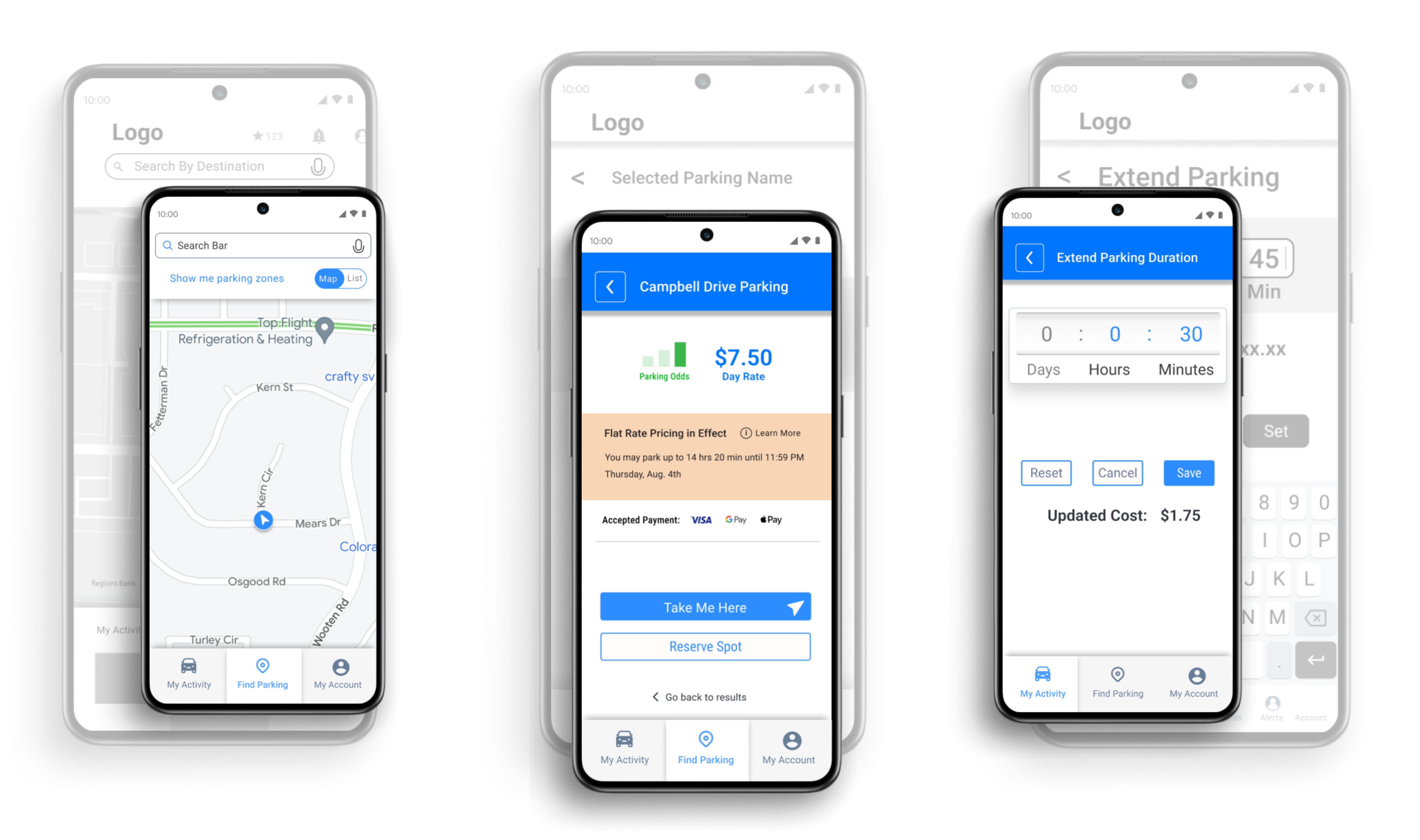
(See the Prototype in Action! Note, some parking names and details are placeholder/generic and may change from map view to other screens.)
Primary Research | Hueristics | User Persona
Through secondary research, I was surprised to find the perception “there are not enough parking spaces” was not only off, but the opposite was true.

I looked into the three most popular apps used for finding parking and compared them. I then had an idea of how to approach my app and what to also avoid. (Full Heuristic Analysis, 15 pages)

Through five separate 30-45 min interviews, I gathered as much helpful qualitative data as I could on others’ experiences. Most were conducted virtually. I created a discussion guide to stay consistent with my interviews. I chose my participants based on a screener survey.

I organized the notes from participants into categories/topics. Each color represents an interviewee. I then arranged each sticky note by proximity to similar comments to find clusters of patterns.


.jpg)

Parking cost was a regular concern for 4/5 drivers.
4/5 described confusion about the rules of a parking spot.
5/5 described a feeling of helplessness related to parking.
3/5 said they feel more relaxed with a friend helping in the passenger’s seat.
4/5 said they would change or cancel plans to avoid the hassle of parking.


From interview patterns, I went to Miro again to learn what features my app needed and what tasks users should be able to accomplish with it.

How Might We...
red routes | User stories based on pains & gains

paper sketches to High Fidelity Designs

Map List and Search Screen
While maps are most common, a list view will provide information about distance, price, users can quickly compare at a glance.
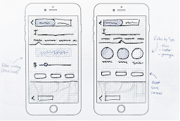
Searching Filters
Filters give users the power to choose based on their preference and only view options that fit their immediate need.

Distance Filter and Selected Parking
For the selected parking option screen, users will need to know the rules, hours and regulations of their chosen spot. This is where they can also commit to this location.


I facilitated a round of guerrilla testing with my refined digital sketches to establish a user-friendly flow and layout. Five individuals tested the red routes of the app, completing the following actions:

.png)
.png)

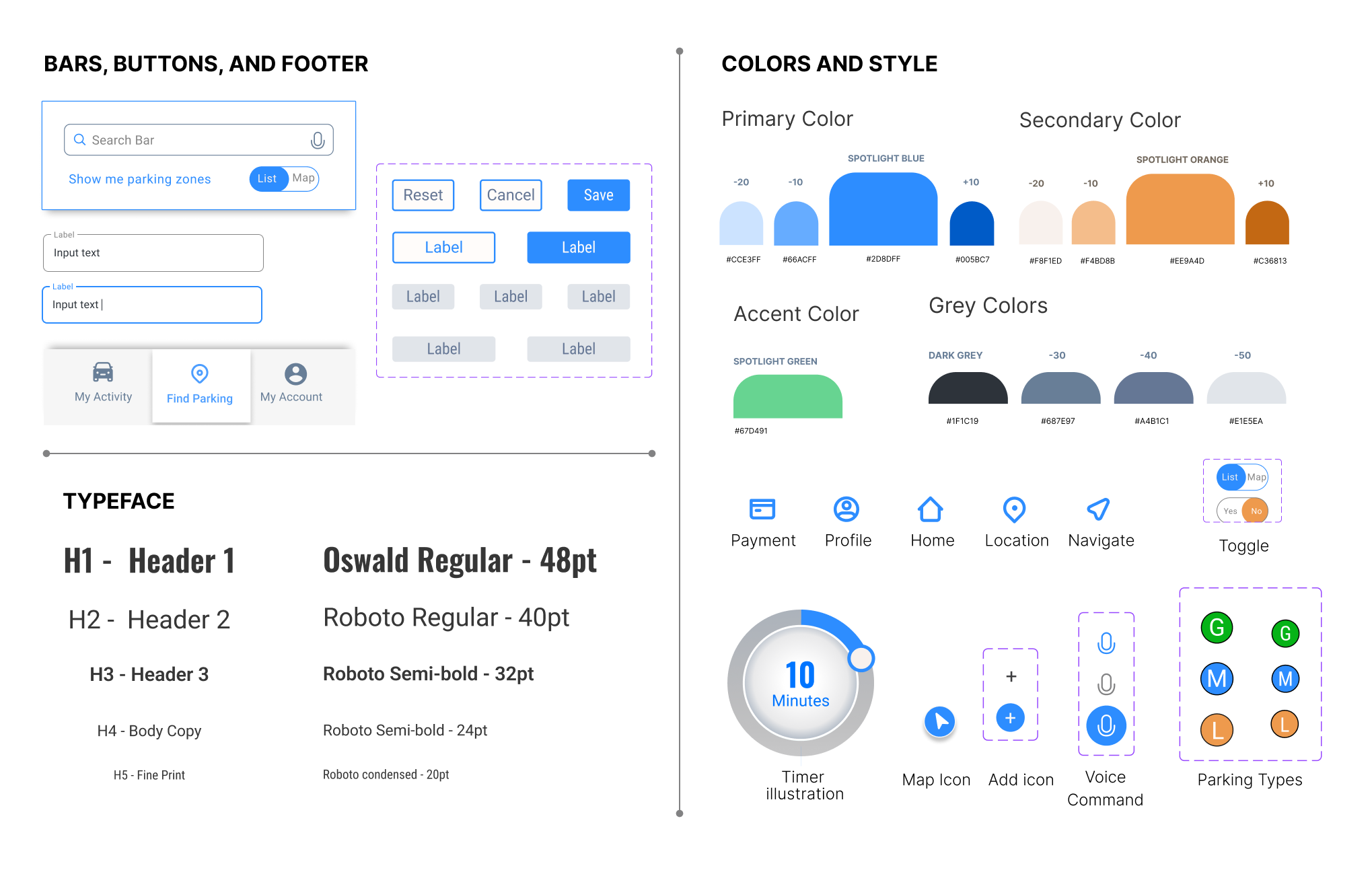
color | Typefaces | styles
I established visual elements including color, typefaces and font choices, button and icon styles, etc. I wanted a style that aligned with the app’s brand characteristics.

usability testing and findings
The last stage was to add motion and interactions. Buttons are clickable, screens could be scrolled, etc. A total of 10 individuals tested the red routes (key journeys) of the app in two rounds (five participants per round).


I am most proud of the fact that each task had features and flow that were just what my users were looking for, especially for those who find current parking apps frustrating.

3 of 5 users felt the app was “clean,” “uncluttered,” and “all the info you needed” was available.

5 of 5 users valued the app’s features (such as the timer, paying, and search filters).

2 of 5 users voiced a positive reaction specifically to colors used in the app.
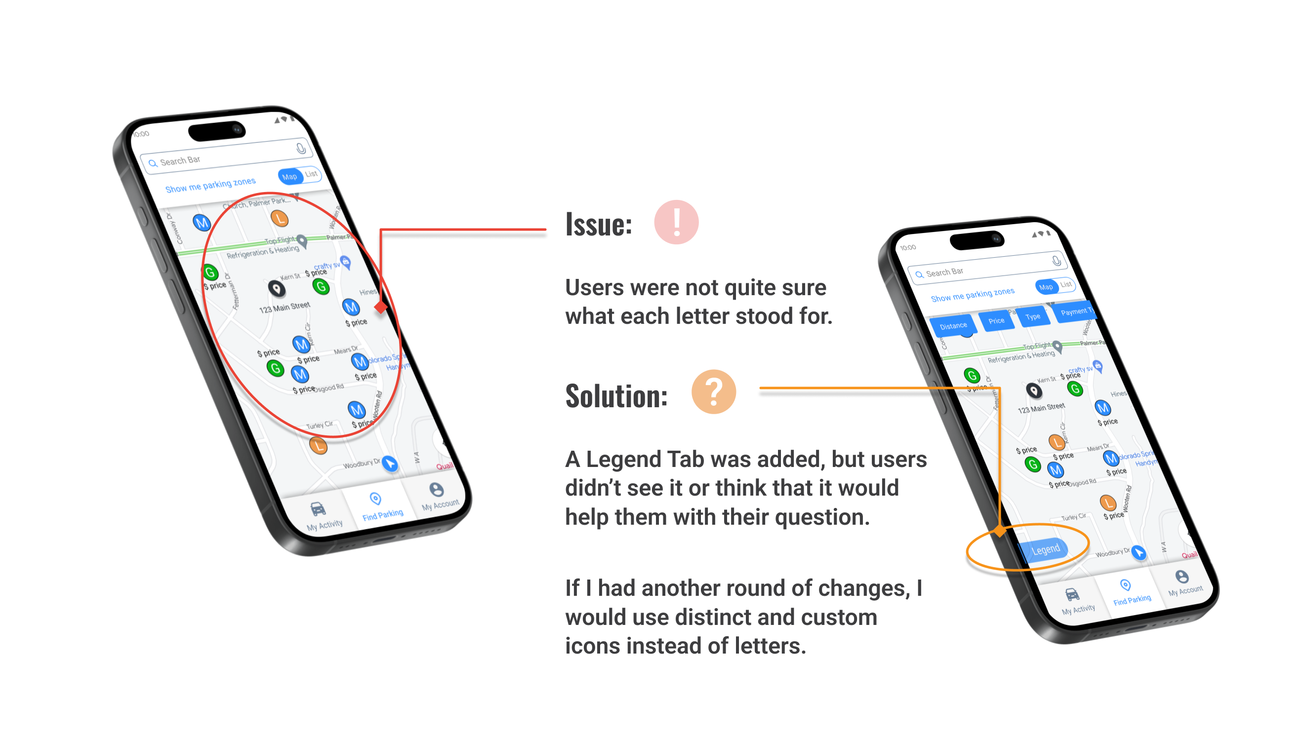
Our perceptions of a problem are not always accurate. Research is vital to understanding the true problem to be solved.
Curiosity should lead throughout. Understanding why ‘obvious’ fixes (eg. the legend tab) actually didn’t work led to a much clearer understanding of my users.
Be patient, and focus on stages. My tendency at first was to design nearly everything all together, even trying to establish prototyping ahead of time within Figma. Working with a more steady approach proved to be better, taking parts in stages, presenting and gathering feedback, then refining pieces along the way.
