

From Free-mium to Premium
A startup company launched a media product, Viben, which has a mobile-web experience and a mobile app for both iOS and Android. The company’s business strategy was to first build a user base with a free product and then evolve the feature set to monetize on a premium (paid) product. Viben has been well received and has a healthy user base of free users. They now need an experience that will allow users to subscribe and pay a monthly fee.
UX/UI Bootcamp Capstone
January - February 2024
UI /UX Designer
User Researcher
Competitor Research / User Interviews / Journey Map / Lo-fi and Hi-fi Wireframes / Prototypes
Problem: How give new and current users the opportunity to upgrade to the paid subscription? (and in turn, start gathering revenue through the app)?
Solution: create opportunities to upgrade to the paid subscription that showcase features and benefits that align with needs and values of the target users (and in turn, start gathering revenue through the app).
target users | strategy | competitor comparisons
Gen Z thinks differently about subscriptions. Initially I would have guessed that getting a deal or price would be the top driving factor. However, that’s my millennial mindset talking. After synthesizing the research, I discovered some interesting practices and insights of the target user.
An internet-based survey conducted in 2023 by Recurly uncovered a wealth of helpful information regarding Gen Z preferences, specifically for subscription services.
persona map of target subscriber
.png)
“Churn and return” — Short-term plans, returning as desired.


strategies for conversion
I searched for current upselling strategies and discovered ones that related well to our goal and target users. Sources included Intentux.com (specific to in-app marketing), and Pushwoosh Blog (increasing revenue in a subscription-based mobile app).
Based on this data, along with competitor research, here was my gameplan for presenting upgrading opportunities:
65% of Gen Z are more likely to subscribe if a free trial is available (Recurly.com, 2023).
Demonstrate features when prompting upgrades, or when there are areas of friction for users.
This directly connects the user’s point of friction with a solution and the value of an upgrade.
Allow users options for subscription plans - options of how to pay, frequency of pay, ease of upgrading and returning.
Gen Z values personalization and flexibility in their subscription plans.
A paid subscription is a standard option for popular media apps, and each app handles it differently. I chose YouTube, Pandora, and Spotify as all three are well-known and were well-reviewed on the GoogleApp Store. See full comparison

Above: I examined the sign up flow for each competitor then walked through using the app to find opportunities for compelling users to upgrade. I could see which strategies were used and where in the journey.
With a better understanding of the typical Viben user and other strategies, I used that information to inform the flow and architecture of the app itself.
User Flows | Lo-Fi Wireframes
I used Figma for this stage, creating flows that would allow users the opportunity for upgrading if they choose. I created a Flow Chart first to get a visual of the new user and the current user’s journeys, and to see where I could incorporate opportunities (CTAs) to upgrade.


I included CTAs during the Create Account flow and throughout the user's journey interacting with the app itself.

Branding | style guide
Viben, as the owners describe it, is meant to feel “uniquely diverse, but somehow always familiar.” This piece especially resonates with the borrowed ‘nostalgia’ of the target user. Gen Z in particular loves rediscovering nostalgic culture and technologies, then revamping it to be something ‘unique’.
For usability, users should feel familiar with the interface, with the ability to discover what’s different about this app.
This project had no provided name, logo, or visual style of any kind, so I had the freedom to create something to resonate with the target audience. It also provided the opportunity to express brand attributes.


“Vibing” is used colloquially as a verb, expressing a “positive feeling.” It’s especially common among Gen Z, and lends itself well to media. To say you are “Vibing” is to say you’re feeling good, positive, “just chilling” etc.
Colors are meant to demonstrate excitement, optimism, confidence and fun. Reminiscent of late 90’s and early 00’s bright colors in fashion, packaging, and shows, calling on nostalgia in a new, hip application.


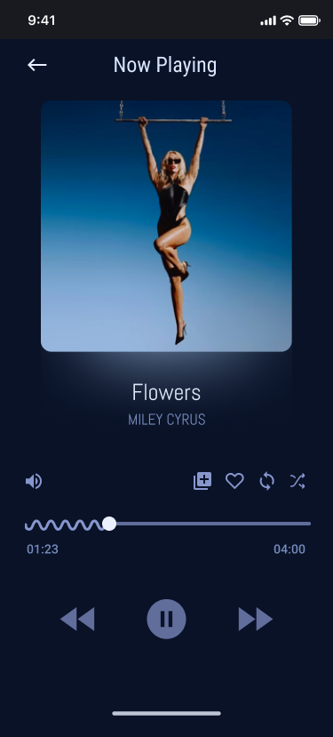
wireframes and prototype
I started with low fidelity wireframing to conduct usability testing. Once I had gathered valuable feedback, I was able to begin applying the design and branding into a hi-fidelity prototype.


Motion and Interaction
2 Rounds of Usability Testing
I began with testing the lo-fi wireframes virtually with 3 users. Following my script, each user had to complete the following actions:
During each test, I took notes in the Notes app on Mac to gather observations and quotes for each action. I converted the notes into a chart to compare each user’s experience together. I found some key issues users ran into that also hindered my goal:


Solution: Make the text larger, and use brand typeface once ready for the Hi-fi design. The contrast between the brand colors was preemptively investigated and adjusted to prevent any contrast issues in the Hi-fi design.
.png)

After creating the hi-fi prototype, I ran usability testing again, this time with 5 users. My solutions worked, and new observations came to light.

See the full report.

All 5 users expressed a positive reaction to the design of the app (color, feel, usability) including that it ‘felt familiar.’
All 5 users had a positive response to search ability, skip, and choose later within the create account flow.
All 5 users liked the 30-day trial, but assumed they would be charged right after the trial, based on experience with other subscription apps.

2 users said it gave them a sense of freedom during the task, as well as control.
Early on, it is best to be descriptive rather than prescriptive. A question asked in the company notes was “should we even put a CTA in the create account flow?” Testing confirmed the answer was no--inform, but don't make an ask that early.
Your audience or target users will be unique. Understanding how one set of users differs from another is crucial when designing especially for your target audience.
Know when to think outside of the box. My design followed a very typical layout and architecture like most media apps. Opportunities to create uniqueness came in small details, such as the progress bar, colors, and branding.
