

5–Day Sprint Project
This design sprint was a 5-day process to address key questions through creating, prototyping, and testing ideas. This project is a modified version of a Google Ventures design sprint. While normally done within a team, this was a solo project as structured by Springboard.com.
UX/UI Sprint Project
January 2024
UX & UI Designer /
Test Facilitator
User flows / User testing script & data / Wireframes
Problem: SAVR is a recipe app for at-home cooks with a large amount of negative reviews surrounding the experience of following recipes.
Solution: Provide an in-app modification improving the experience, and encouraging positive reviews. (See the demo of the solution below)
User persona and stories | competitor comparison | Website Audit

The graphic above depicts a possible user experience. Recently reviews are negative of certain recipes. The quality of recipes on the app are well-reviewed. The problem does not arise until the users begin to follow the recipe.
When users follow a recipe, they are frustrated and often unhappy with their results. Based on provided research from user interviews, and user personas, the following areas were sources of complaints for users:
Based on provided interview data, I had the following persona to reference:
“I like to be as prepared as I possibly can before I start cooking things…”

competitor overview | solution sketches

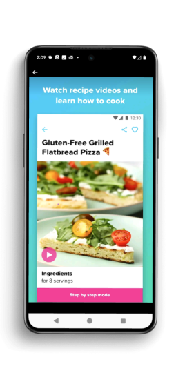


I chose the actual recipe screen as the most critical. It is this screen that users report having issues with. It is also the most necessary screen in order for users to follow a recipe at all.
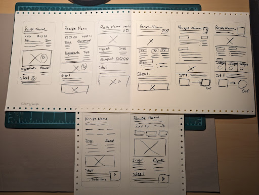
Below: Crazy 8s Brainstorming for Critical Screen

Solution Sketch | How does this solution help users?
After brainstorming on the most critical screen on day 2, it was time to narrow down the ideas. Day 3 would provide time to run through the user journey and refine the UI from the solution sketch.
STORYBOARD | UI Sketches
Within the storyboard, we can see the user’s steps within the app as well as outside of the app, according to the end-to-end experience sketched out on day 1.

This storyboard provided a context, and provided MVP's of the product:
By the end of day 3, I had a framework of my solution within the context of the user’s experience. On day 4, it was time to take my sketches into a high-fidelity design.
High Fidelity Designs
I put my solution from Day 3 into a high-fidelity form, finding key moments along the way where I could directly address user pain points (below):

I built up high-fidelity sections of the app according to the SAVR Brand. Since my goal was not to “redesign” or rebrand, I wanted to maintain color, typography, and style as closely as possible.


By the end of day 4, I’d confirmed most of my users for testing. While some had to reschedule or completely cancel, I was able to find 5 users/testers to help validate this solution. On to day 5!
User testing | further revisions
I conducted testing with 5 individuals via Zoom with the following criteria: Adults, providers/decision makers when it comes to their meals, and smartphone users. Each was familiar with following recipes as well as online recipes.
I took notes while the test was in session, asking my scripted questions at the end as well as any clarifying questions to follow up. My questions were geared towards the key goal of the project and the most common complaints found from research:

All 5 users expressed a positive reaction to the design of the app (color, feel, usability) including that it ‘felt familiar.’
All 5 users felt the instructions were “clear and straightforward”
All 5 users said that they would use this app again for future recipes.

4 of 5 users felt they could reference provided videos to get additional clarity on technique or written instructions.
“I would have full confidence in doing more difficult [recipes with this app]. I would be guided in a seamless way.”
“ I want to go back now and change my [ sprint ]design!”
“1000 times yes! I wish more recipes would mention storage and shelf life.”
While the primary issues from Day 1 were addressed, users had a few observations that provided even further insight to the design. As long as the observations were relevant and did not fall outside of the scope and main goal, I made further adaptations to the design.


The sprint offered a unique challenge of regular time constraints for each stage–I learned quickly that keeping the main goal of the project at the forefront was vital to staying on track. In testing, users described fun ideas for recipe searching or for community engagement…while new features sounded exciting, if an idea didn’t help the experience of following a recipe, it wasn’t necessary.
When making the prototype, I had to be very aware of time spent. I found that after creating a screen, making reusable components–like pre-made building blocks–could streamline the work. It especially helped later when making changes after testing input!
I had to remind myself of this regularly–when strapped for time, ruminating on half a dozen solutions and ideas is not an option. Instead, running each solution through the lens of “Does this help address concerns and reach the goal? Is it within project constraints?” kept things simple.